
but how about looking at financial crisis contraction/stagnation events ?
"We actually look better than most " ---if you ignore Japan---
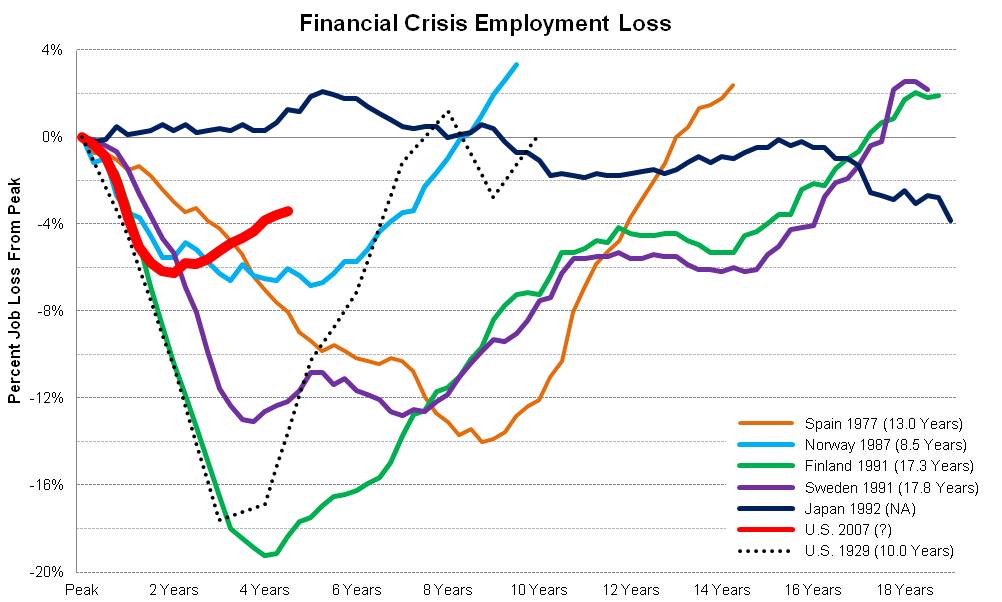
":US economic performance since the financial crisis comprted with other episodes of major financial crisis. "
pk
that's uncle's economy in red
"protracted weakness is normal after a big financial crisis"
ya but is it necessary
or could we Kalecki our way on out of this
and in a Vickrey second
that is the superimposable question eh bub
pk
"we should have done even better: if stimulus works, and the evidence says that it does, we should have done more, and made the slump even shorter and shallower"

to really see who got rated here :
Spain 1977 tan
Norway 1987 lite blue
Finland 1991 green
Sweden 1991 purple
Japan 1992 royal blue
hmmmm nordic nite mare
eternally tormented Spain
plus japan
and japan kicks our butt
oh ya you can toss in the medicine ball
haunting our collective memory
the american great depression.... here teaced with caspar the ghost like dots